

Illustration: Lia Popaz IG: @lippo.ai
The best typeface for people with dyslexia
By: Hanna Wallström IG: @lowallstrom
14 November, 2023
Usually, when reading, we don’t often reflect on whether the kind of font used in a text has its downsides. Times New Roman is often the default font when writing assignments or exams at Malmö University. This may cause students to trust this font above others and default to it even when they are writing outside academia. But what if I told you that it’s not the best typeface to use when writing articles for the public?
There are a few categories for different fonts. The most common are called serif and sans serif, but what does that mean? A serif typeface has small strokes, or extensions, at the end of the letters’ longer strokes. Such fonts are mainly used for longer texts as they have traditionally been seen as easier to read. Times New Roman, Georgia, and Courier are different kinds of serifs. A font that is sans serif doesn’t have the small strokes and has a cleaner and more modern look. It’s more commonly used for headlines. Our University logo has a sans serif typeface. Helvetica, Arial, and Calibri are some of the popular sans serifs. There are, of course, other kinds of fonts, such as slab serif, which have a thicker look to them.
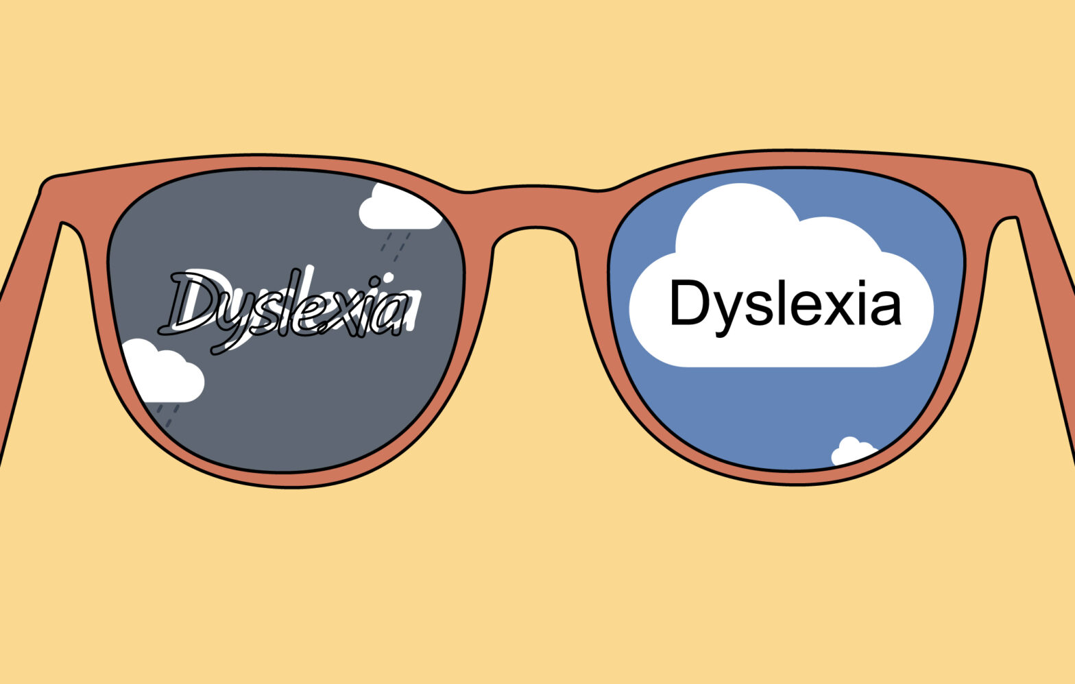
So, what is the easiest typeface to use? This is a complicated question to answer because, in reality, the easiest font to read depends on how used a person is to reading a specific font. However, through research, it has been revealed that sans serif may be the best font to use when targeting a broader readership. Specifically, it’s easier for people with dyslexia to read different kinds of texts if they are in sans serif. Additionally, it’s easier for them to read a font that is in roman with monospaced letters. The fonts shouldn’t be in cursive, and the letters should be equally spaced to enhance readability. Arial is an excellent example of a font that is sans serif with a high readability, but this significantly decreases when Arial is in italics. While Arial is not monospaced, the typeface Courier is an example of a monospaced serif that is easier to read because the spaces around the letters are the same in that font.
How come it’s better to use a sans serif font? Well, it has fewer strokes, which makes a text easier to read and at the same time doesn’t make the letters tangle together visually as a serif might do. Researchers have also created different kinds of sans serif fonts that are intended to be better for people with dyslexia. Fonts like Dyslexie and OpenDyslexic are specifically designed to be easily readable and have an extra feature that attempts to make mirrored letters, like d and b, more distinguishable from each other. These fonts also have a heavier bottom to differentiate the different letters better.
They are unfortunately behind a paywall, but there are other fonts that are still great to use. Research has shown that the following typefaces are great to use: Arial, Open Sans, Verdana, Helvetica, CMU, and Courier. There are, of course, a lot more fonts that can be used, but we will start with these for now. But the best one to use should be a sans serif and/or should also be monospaced.
So, all in all, choosing your font matters. The right font can increase the readability of a text for a lot of people. Arial, Helvetica, and Courier are a few of the typefaces that have great readability. And why don’t you try some of them out? Maybe you’ll find a font that becomes your favourite. Because you’ll never know until you try.
Sources
https://www.extensis.com/blog/whats-the-best-font-for-people-with-dyslexia
http://dyslexiahelp.umich.edu/sites/default/files/good_fonts_for_dyslexia_study.pdf